Empathy Is an Engineering Skill: Notes on Inclusive Mobile Development
What mobile development misses when accessibility is treated as a web problem — and what changed after I met the people we had been building for.
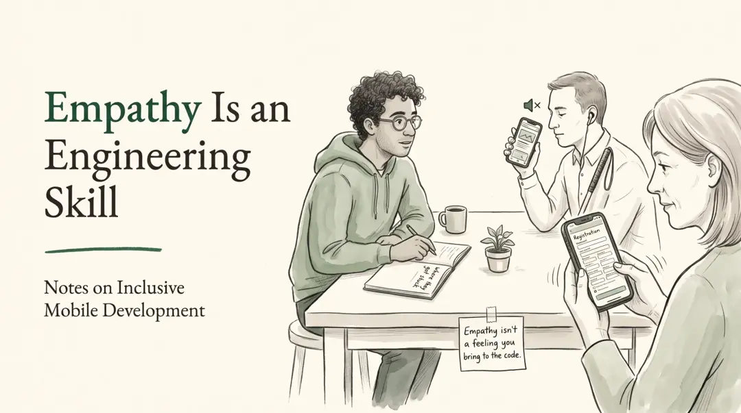
The meeting where users became real
Every major group of disability was represented in that room, and I heard more problems than I can retell here. Two of them stayed with me: one took a week to fix, the other is still open, because it was never a bug.
I was in a meeting with a coalition of disability organizations and researchers. They had tested the public-service super app I work on, with the people it is supposed to serve: blind and low-vision users, Deaf users, people with physical, intellectual and psychosocial disabilities.
One participant lives with a tremor. For them, every form field is a small negotiation with their own hand.
A typical public-service registration flow asks for an email, a one-time code split into tiny boxes, a password, an identity number, a phone number, and a full address. On paper, each step is reasonable. Under a shaking finger, together, they are exhausting.
Another participant is blind. They opened a menu that loads a web page inside the app, and TalkBack went silent. The screen was full of information. None of it could be heard.
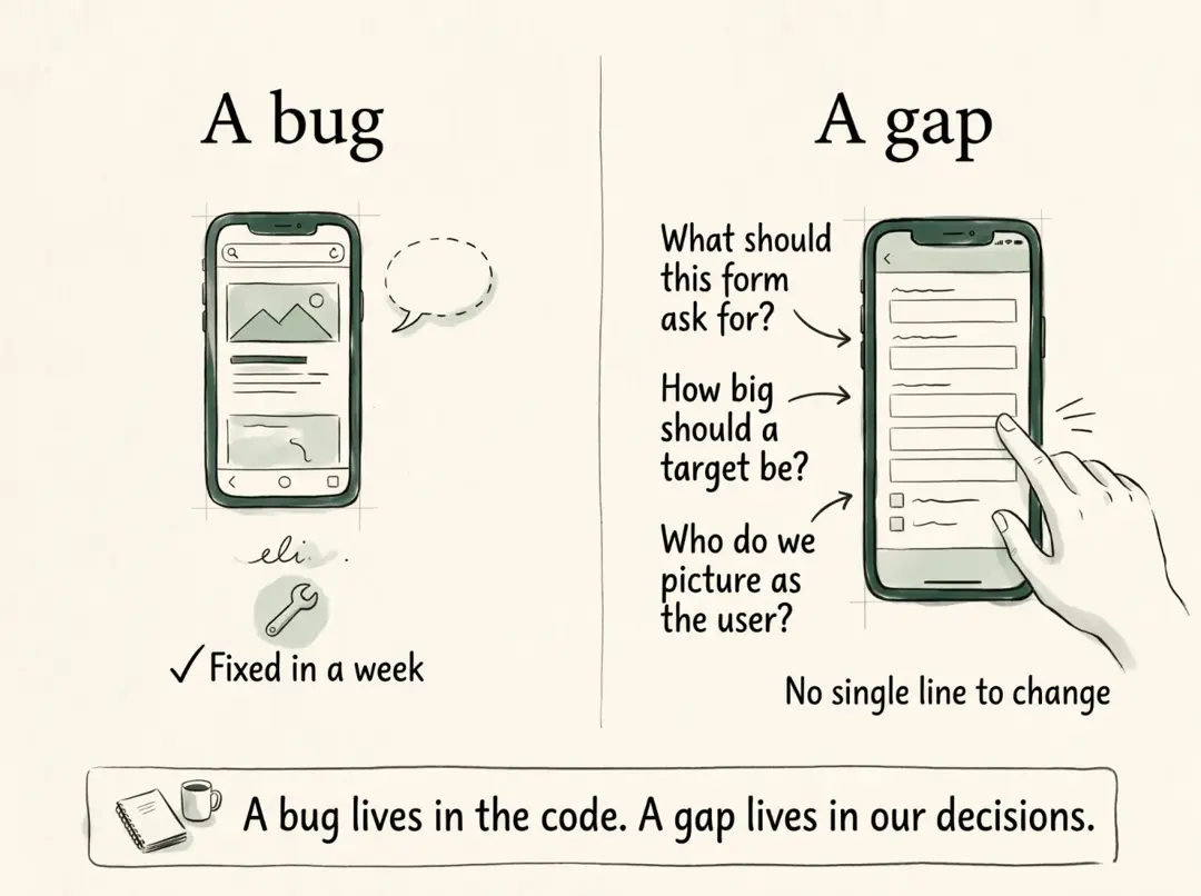
That second problem I could fix. The root cause was a known bug in the WebView plugin we use: the native container never let the screen reader focus inside the page. The fix was a small patch in a vendored copy of the plugin, tested before and after with TalkBack.
The first problem had no line to change. It lived in how we decide what a form should ask for, how big a target should be, and who we picture when we say "the user".
Nobody made a speech about it. They simply showed us, on the app itself, the moments where they got stuck.
I had read about barriers like these before. I only understood them when I watched someone run into one.
That difference, between an accessibility bug and an accessibility gap, is what this essay is about.
What I believed: a gimmick, and someone else's problem
I used to think accessibility features on the web were a gimmick. I was half right about the widget and completely wrong about the need.
You have probably seen the widget. A floating icon on a government site opens a panel with buttons for bigger text, higher contrast, maybe a voice reader. I never saw anyone use it, so I concluded nobody needed it.
Accessibility practitioners criticize those widgets too, but for a different reason. The Overlay Fact Sheet argues that the people they claim to serve already have these features built into their devices. If a site needed the widget to be usable, the user would need it on every site, so they rely on their own tools instead.
In other words, the widget looked like a gimmick because it was bolted on. The need underneath it was real. The work that actually matters sits in the structure: labels, contrast, focus order, text that can grow.
On mobile, I made the opposite mistake. I assumed the operating system had accessibility covered. Android has TalkBack, iOS has VoiceOver, both let people enlarge text system-wide.
Then I learned how easily an app can undo that. In Flutter, one line at the root of the app is enough:
// one line at the app root
MediaQuery.withNoTextScaling(child: app)
The operating system offers the feature. That line switches it off, for every screen, for every user. Nobody decided to exclude people with low vision; somebody decided a layout should not break. The effect on the user is the same.
Why mobile gets overlooked
Accessibility feels like a web topic because almost every tool and benchmark we hear about is built for the web. Mobile apps make the same mistakes with fewer instruments pointed at them.
The research team itself showed the gap. For government websites, the earlier SAFEnet and Universitas Hasanuddin study could run WAVE, an automated checker; the coalition's fact sheet reports that all 20 sites tested failed WCAG 2.1 AA. For our app, there was no equivalent scanner to run. People had to sit with the app and try it.
Even the standard was written for the web first. WCAG reached native apps through a separate W3C note, WCAG2ICT, which explains how web criteria apply to non-web software. Its latest version was published in December 2025.
| Web | Native mobile | |
|---|---|---|
| Standard | WCAG, written for web content | WCAG via the WCAG2ICT note, plus Apple and Google platform guidance |
| Public benchmark | WebAIM Million, yearly since 2019 | Occasional research snapshots, such as UW's ~10,000-app analysis |
| Common default tools | Browser extensions, CI linters | Flutter's default lint set has no accessibility rules |
| Where a fix lands | On the next deploy | After store review, on phones that update |
The UW researchers found that 23% of the Android apps they analyzed left more than 90% of their image buttons without a label. They also found that common developer tools did not flag missing labels on floating action buttons, 93% of which had none.
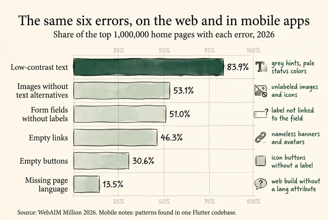
When I audited our own Flutter code, the result looked uncomfortably familiar. The six errors WebAIM finds on most of the web's top home pages showed up in an app that is not a website.
Data as a table
| Error type | Share of top 1M home pages, 2026 (WebAIM) | How it shows up in a mobile codebase |
|---|---|---|
| Low-contrast text | 83.9% | Light grey hints and inactive tabs, pale status colors on tinted backgrounds, below the 4.5:1 minimum |
| Images without text alternatives | 53.1% | Images and icons with no semantic label, often because the shared image widget has no parameter for one |
| Form fields without labels | 51.0% | Labels drawn as separate text above fields, not linked to them |
| Empty links | 46.3% | Tappable icons and banners with no name |
| Empty buttons | 30.6% | Icon buttons, especially back and close buttons, with no label or tooltip |
| Missing page language | 13.5% | A Flutter web build whose HTML template sets no language attribute |
Mobile also adds problems the web rarely has:
- Hybrid screens. Many menus open a city agency's web page inside a native WebView. One plugin bug can silence a screen reader for every one of them.
- Server-driven UI. Menus driven by Remote Config or a CMS can easily carry a title, an icon URL and a few flags, but no field for an accessible label.
- OS settings the app can override. A single line in
main.dartcan disable system text scaling for every screen. - Slow fixes. A wrong label on the web is fixed in minutes. On mobile it waits for a build, a store review, and a user who updates.
Real users, not edge cases
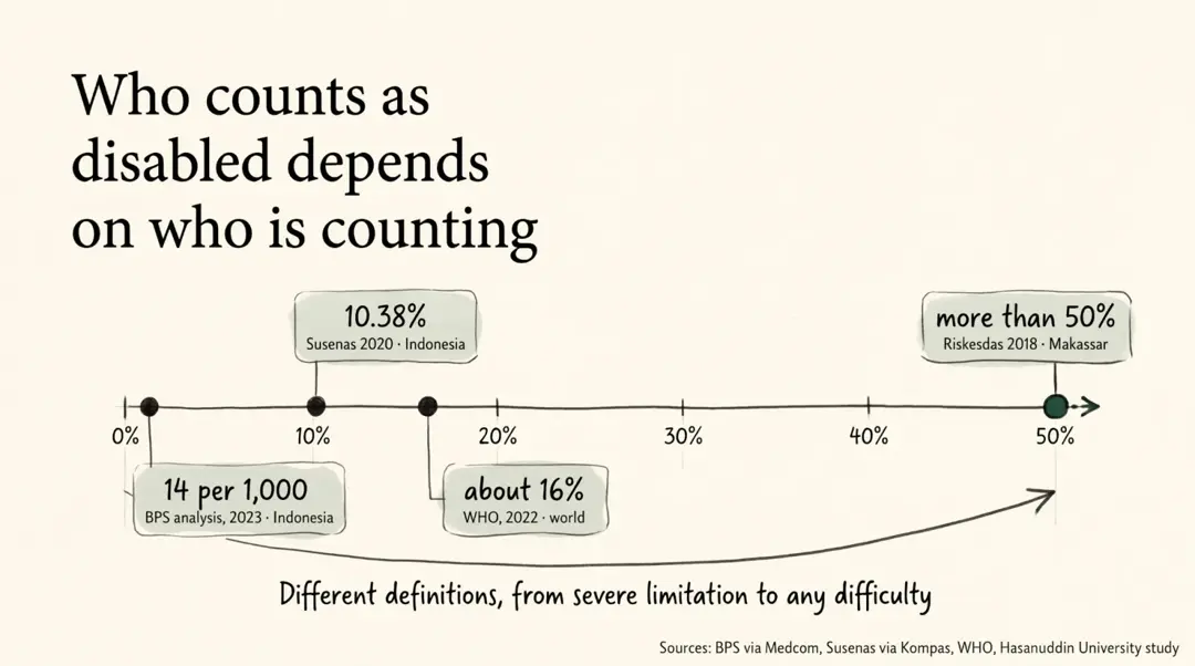
People with disabilities are not a niche segment. How many there are depends mostly on who is doing the counting.
Data as a table
| Source | Population | Share with a disability |
|---|---|---|
| WHO global report, 2022 | World | about 16%, roughly 1 in 6 people |
| Susenas 2020, as cited in Kompas | Indonesia | 10.38%, about 28 million people |
| BPS, Thematic Population Analysis 2023 | Indonesia | 14 per 1,000 people |
| Riskesdas 2018, cited by a Hasanuddin University study | Makassar | more than 50% report some form of disability |
The gap between 1.4% and 50% is not noise. Each survey defines disability differently, from severe limitation to any difficulty at all. The definition decides who is counted, and whoever is counted is whoever gets designed for.
The participant with a tremor might not appear in a narrow statistic. They still have to finish our registration form.
The stakes are practical. An analysis of Susenas 2020 data found that people with disabilities who use the internet are 4.44 times more likely to be employed than those who do not.
The stakes can also be physical. In February 2025, 3,653 Makassar residents were evacuated from floods. A UNDRR global survey reports that people with disabilities are, in some disasters, killed at two to four times the rate of the general population. With sufficient early warning, 39% of its respondents said they could evacuate without difficulty, against 26% without one.
An emergency notification that a screen reader cannot read is not a minor bug in that context.
Empathy arrived late
I did not learn any of this from guidelines. I learned it by sitting across from the people the guidelines are about.
Research suggests that is the point. A study in Rehabilitation Psychology, "Crip for a Day", found that disability simulations, such as wearing a blindfold for a few minutes, often produce fear and pity rather than understanding. Its author's advice is to visit real people with disabilities, "and lots of them."
Bennett and Rosner make a similar argument for design teams at CHI 2019. Empathy exercises built on imagining disability can further distance people with disabilities from the design process.
That matches what happened to me. Reading WCAG did not change how I write a form. Watching someone try to finish one did.
UI/UX is where inclusion is decided
A screen that only works for a steady hand, sharp eyes and full attention was designed for an imagined user. Most accessibility problems are decided in design reviews long before an engineer writes a widget.
We used to judge a flow by one question: is it easy? The meeting added a second: easy for whom?
Microsoft's Inclusive Design principles put it in three lines: recognize exclusion, learn from diversity, solve for one and extend to many. The last one matters for product teams with tight budgets. A larger tap target designed for a tremor also helps someone tapping on a moving angkot.
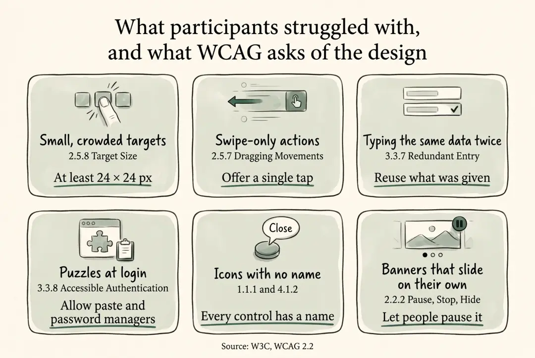
The newest version of the standard reads almost like notes from that meeting. WCAG 2.2, published in October 2023, added criteria that map directly onto what participants described.
Data as a table
| What participants struggle with | Related WCAG criterion | What it asks of the design |
|---|---|---|
| Small, crowded targets under a shaking hand | 2.5.8 Target Size (Minimum) | Targets of at least 24 by 24 CSS pixels, or enough spacing |
| Swipe-only or drag-only actions | 2.5.7 Dragging Movements | A single-tap alternative; W3C's own persona is a retiree with a hand tremor |
| Typing the same data again across steps | 3.3.7 Redundant Entry | Reuse or auto-fill information already given |
| CAPTCHAs and memory puzzles at login | 3.3.8 Accessible Authentication (Minimum) | No cognitive test without an alternative; allow paste and password managers |
| Images and icon buttons a screen reader cannot name | 1.1.1 Non-text Content, 4.1.2 Name, Role, Value | Every meaningful image and control has a text name |
| Banners that slide by themselves | 2.2.2 Pause, Stop, Hide | Moving content can be paused |
Some needs sit outside any checklist. A "Contact us" page that lists only a phone number excludes Deaf users who cannot make a voice call. A text or video-call channel is a service decision, not a widget.
In practice, the change for our team is small to describe and hard to keep:
- Every design review asks who cannot use this screen, not only whether it is clean.
- Forms ask only for what the service needs. That serves people with a tremor and data-protection law at the same time.
- Shared components carry accessibility by default, so a new screen inherits labels, readable errors and adequate targets without anyone remembering to add them.
- People with disabilities test the flow before release, not after a coalition publishes a report.
What a mobile engineer can use today
You do not need an accessibility department to start. Most of the tooling already ships with Flutter, Android and iOS; it is simply rarely switched on.
| Layer | Tool | What it catches | Source |
|---|---|---|---|
| Flutter release checklist | TalkBack and VoiceOver passes, 4.5:1 contrast, 48 by 48 targets, very large text scales | A shared definition of done for every release | Flutter docs |
| Flutter widget tests | meetsGuideline with tap-target, labeled-target and text-contrast guidelines | Unlabeled controls, small targets and low contrast, in CI | Flutter accessibility testing |
| Flutter package | accessibility_tools | Missing labels on buttons, inputs and images, small tap areas, text overflow at large fonts; debug builds only | pub.dev |
| Android | TalkBack, Switch Access, Accessibility Scanner, Compose testing APIs | Spoken labels, focus order, motor access, layout issues | Android Developers |
| iOS | Accessibility Inspector audit, XCTest accessibility audits in UI tests | Missing labels, contrast, Dynamic Type issues on every build | Flutter docs, WWDC23 |
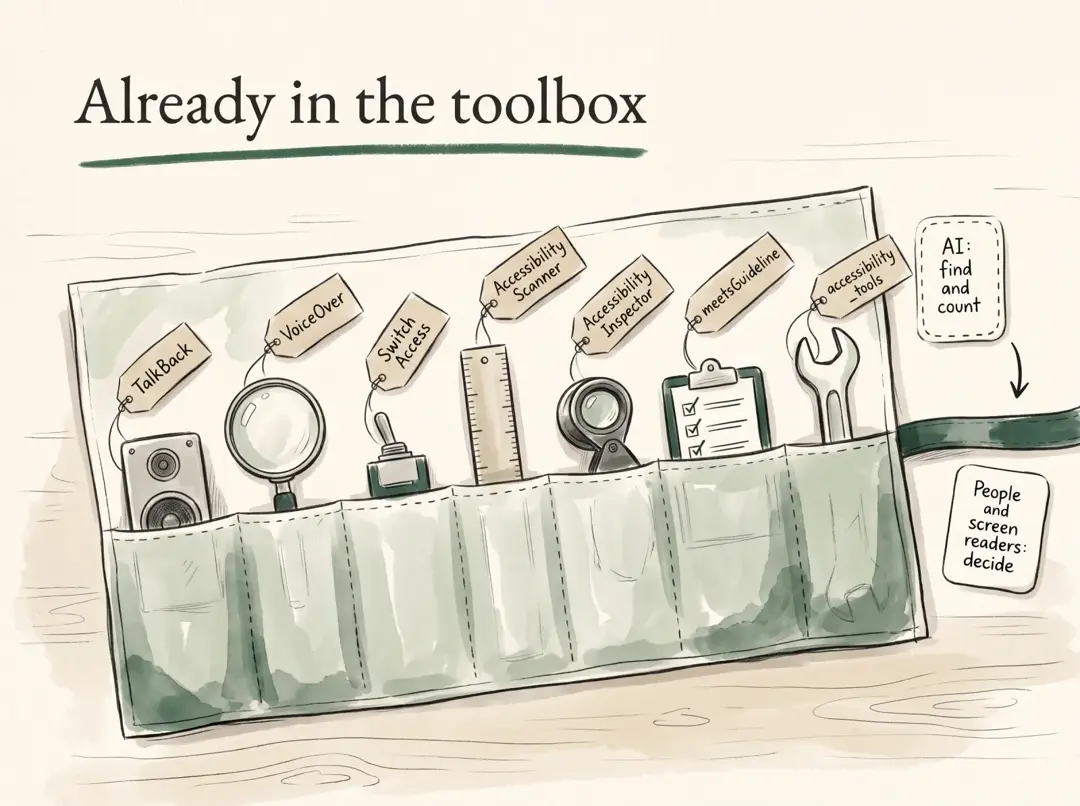
Two details from that list stopped me. Android's own guidance names four approaches, manual, tool-based, automated and user testing, and the last one is people. And the accessibility_tools text-scale toggle notes that it "does nothing if app ignores text scaling". That is exactly the line described earlier.
None of these tools needs a new hire. The guideline tests are four lines in a widget test. The package is one line in MaterialApp.builder. A TalkBack pass on the five main flows takes an afternoon.
Where AI helps, and where it does not
AI is genuinely useful as an auditor. I used an AI coding agent to sweep our codebase. Within hours it produced counts with file and line references for every finding, which would have taken me days by hand.
Apple's research team has gone further. AXNav, presented at CHI 2024, takes a manual test such as "search for a show in VoiceOver" and uses an LLM to run it on a device. It records a video and flags issues such as text that does not grow when Large Text is on.
AI is much weaker as an author. A MOBILESoft 2025 study found 540 accessibility issues in Android interfaces generated by LLMs. Prompts that explicitly asked for accessibility often produced more errors than standard prompts.
So the rule I follow now: let AI find, count and draft. Let TalkBack, VoiceOver and real users decide whether it works.
The real constraint: people and political will
The hard part of accessibility is not knowing what to do. It is having the people, the time and the mandate to keep doing it.
Research says this is not a local excuse. A survey of 110 mobile developers in 43 countries, presented at ICSE 2026, found that developers value accessibility but usually test for it late, and struggle with API limits and organizational constraints. An earlier study of 365 practitioners in 26 countries found large gaps between people who had worked on accessibility directly and those who had not.
Even a national government admitted the capacity problem. The U.S. Department of Justice set WCAG 2.1 AA as the requirement for state and local government websites and mobile apps. In April 2026 it pushed the first deadline back a year, to April 2027, saying it had "overestimated the capabilities (whether staffing or technology)" of the agencies involved.
The scale in Indonesia makes the point sharper. The deputy communications minister counted around 27,000 government applications across ministries and regions in January 2026. Integration into super apps reduces that number. It also means one inaccessible front door now blocks dozens of services at once.
What political will looks like
Where accessibility moved at scale, someone with authority made it a requirement, or a company made it part of the product, not a side project.
| Who | What they did | Source |
|---|---|---|
| China, Ministry of Industry and Information Technology | From January 2021, a national campaign targeted 43 major apps, including WeChat, JD.com and Taobao, and 115 websites to add simpler interfaces, larger fonts and gestures for people with physical disabilities | Global Times |
| European Union | The European Accessibility Act requires a wide range of public and private services to be accessible, using EN 301 549 as its technical basis | Flutter docs |
| United States, DOJ | WCAG 2.1 AA for state and local government web content and mobile apps, including what vendors provide | Duane Morris |
| Grab | GrabAccess tells passengers when a driver-partner has a disability, provides in-car communication cards for Deaf drivers, and reports 6,207 driver-partners with disabilities earning through Grab in 2025 | Grab Indonesia |
| Singapore, GovTech | Built WebAssist, formerly Oobee, an open-source accessibility scanner that agencies can run in CI/CD | GovTech |
Notice what even the strongest public tool on that list scans: websites. The mobile gap is visible at the top too.
For wide-audience apps, government or private, accessibility cannot depend on one engineer's conscience. Indonesian law already asks for it: Law No. 8 of 2016 and Government Regulation No. 42 of 2020 require public services, and protection from disasters, to be accessible to persons with disabilities. What is missing is the budget line, the owner and the deadline.
Fixing the SDLC: accessibility needs an owner
In most teams I know, accessibility has no owner, so by default it lands on whoever touches the code last. The standards bodies saw this coming.
W3C's Accessibility Roles and Responsibilities Mapping describes it exactly: when accessibility is left until late, responsibility often falls on developers, who end up selecting colors, describing images and writing headings, tasks outside their skillset.
The role I wondered about, an accessibility advisor, already exists in mature organizations. The GOV.UK Service Manual says accessibility is the whole team's job, tells teams to budget for training and audits, and notes that accessibility specialists in the team can replace an external audit. It also requires research with disabled users and a published accessibility statement. UK public-sector rules explicitly cover mobile applications.
At the organizational level, ISO/IEC 30071-1 asks for an accessibility policy, accessibility decisions embedded and documented across the whole lifecycle, and an accessibility statement at launch. Its scope names mobile applications directly.
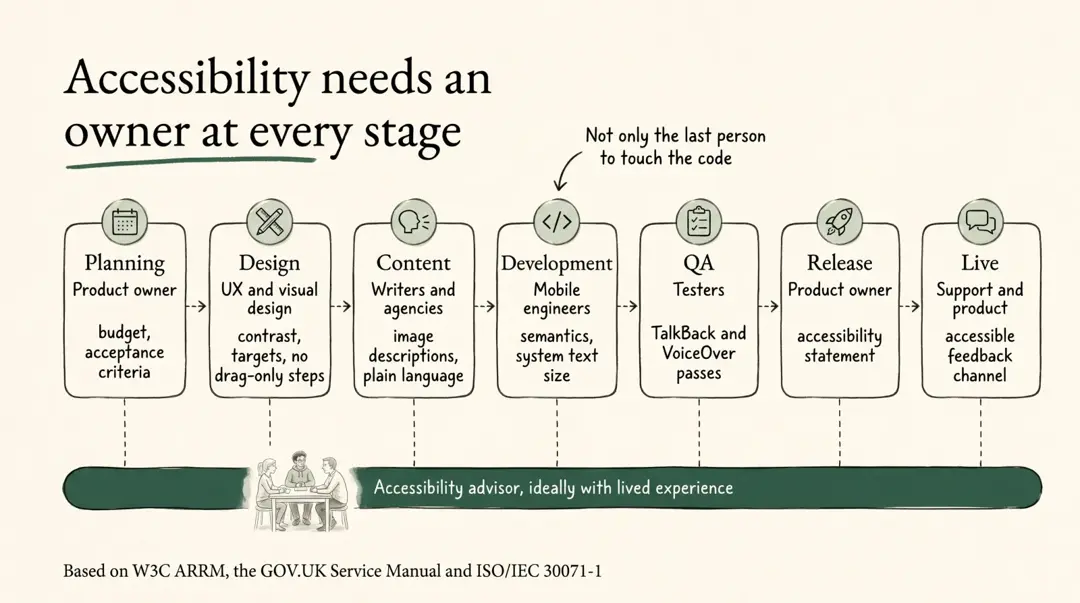
Translated into a mobile team, it could look like this:
Data as a table
| Stage | Primary owner | Accessibility work |
|---|---|---|
| Planning | Product manager or product owner | Budget, acceptance criteria, which user groups test each release |
| Design | UX and visual designers | Contrast, target size, flows without drag-only steps, text alternatives specified in the design |
| Content | Writers, and the agencies that own each service | Image descriptions, plain language, sign-language or captioned content |
| Development | Mobile engineers | Semantics, respecting system text size, accessible shared components |
| QA | Testers | TalkBack and VoiceOver passes, guideline tests in CI |
| Release | Product owner | An accessibility statement and known limitations |
| Live | Support and product | An accessible feedback channel and regression checks |
| Across all stages | Accessibility advisor, ideally with lived experience | Reviews, co-design sessions with disability organizations |
The role does not need to be a full-time hire on day one. The coalition that reviewed our app recommended partnering with a university disability center and disability organizations. That is an advisor role, just located outside the org chart.
What superapp revamps leave out
I went looking for whether big Indonesian superapp redesigns talk about this. In the two announcements I read, Livin' by Mandiri in June 2025 and BRImo in February 2024, the story is simpler navigation and more features. Neither mentions accessibility, disability or older users.
That is not proof that the work is absent. It does show that accessibility is not yet part of how we narrate a redesign. Grab is a useful contrast: it publishes its accessibility work, including an AI voice assistant for riders who are blind or have low vision listed alongside its GrabAccess program.
What a company chooses to announce usually reflects what its roadmap rewards.
What I can't claim yet
This essay rests on one app, one meeting and one audit. Each of those has limits worth stating before anyone quotes the numbers.
- One meeting, remembered. Every group of disability was in the room. I have written about the moments I remember, not a complete record of what was said.
- Code review, not device testing. The patterns described here came from reading one codebase, not from watching TalkBack or VoiceOver on a device. Some unlabeled images may be decorative, and a screen reader may still announce text that a code review misses.
- One fix, one platform. The WebView fix was tested before and after with TalkBack on Android. It does not prove the rest of the app works with a screen reader.
- Statistics that disagree. The population figures use different definitions of disability. I quote them to show the spread, not to pick one.
- Two announcements. The observation about superapp revamps is based on two public announcements, not a survey of the industry.
- Deliberately left out. The audit also found issues outside accessibility. They are being handled with the team and do not belong in a public essay until they are fixed.
To the developers reading this
Start where you are, with the tools you already have. Then ask for the team that this work actually needs.
If you build mobile apps and your team has no accessibility specialist, you are not powerless. Turn on TalkBack and complete your own registration flow using only the screen reader. Add the four guideline checks to one widget test. Put accessibility_tools in your debug builds. Ask an AI agent to count your unlabeled buttons, then verify what it finds.
None of that requires a new hire or a new budget line. It requires deciding that the person with a tremor and the person using a screen reader are users, not edge cases.
But be honest about the ceiling. Habits and AI can clean up labels and contrast. They cannot write sign-language content, redesign a form around data minimization, or bring disability organizations into every release. A mature ecosystem needs a mature team: a product owner who budgets for it, designers who own contrast and flows, QA who test with assistive technology, and an advisor who has lived it.
If you lead a team, government or private, that part is yours. Political will is not a slogan here. It is a line item, an owner and a deadline.
I fixed one bug in a week because a blind participant ran into a screen that stayed silent. The gap took longer to see, because it was mine.
Empathy, it turns out, is not a feeling you bring to the code. It is what happens when you finally meet the people the code was supposed to serve, and let that change what you build next.
With thanks
This essay exists because a coalition of organizations did the slow work first: testing the app with the people it is meant to serve, writing down what they found, and then sitting across the table from the people who build it.
Thank you to SAFEnet and Jaringan Advokat Digital SAFEnet, Sahabat Disabilitas Makassar, HWDI Sulawesi Selatan, Yayasan Sahabat Sindroma Down Istimewa (SSDI), Kelas Menulis Tuli, Sanggar Seni Disabilitas Sipakatau, Rumah Mama Sulawesi Selatan, Global Inklusi Cendekia, Bumi Setara, Ruang Jurnalis Perempuan, AJI Makassar and Harian.news. Together they wrote the October 2026 fact sheet and policy recommendations on digital rights for persons with disabilities in public services.
Reading their findings was not comfortable. It was necessary.
And thank you to every participant who showed us, patiently, where they got stuck. You did not owe us that patience.
References
Standards and guidance
- W3C WAI, What's New in WCAG 2.2 (2023)
- W3C, Guidance on Applying WCAG 2 to Non-Web ICT (WCAG2ICT), Group Note, December 2025
- W3C WAI, Accessibility Roles and Responsibilities Mapping (ARRM)
- ISO/IEC, 30071-1:2019, Code of practice for creating accessible ICT products and services
- GOV.UK Service Manual, Making your service accessible: an introduction
- Microsoft, Inclusive Design
- Overlay Fact Sheet
Research
- Bennett, C. L. & Rosner, D. K., The Promise of Empathy: Design, Disability, and Knowing the "Other", CHI 2019
- Nario-Redmond, M. et al., "Crip for a Day: The Unintended Negative Consequences of Disability Simulations," Rehabilitation Psychology, 2017 (summary)
- Ross, A. S. et al., "An Epidemiology-inspired Large-scale Analysis of Android App Accessibility," ACM TACCESS, 2020 (UW CREATE summary)
- Indika, A., Kazman, R. & Peruma, A., Practitioner Views on Mobile App Accessibility: Practices and Challenges, ICSE 2026
- Bi, T. et al., Accessibility in Software Practice: A Practitioner's Perspective, 2021
- Taeb, M. et al., AXNav: Replaying Accessibility Tests from Natural Language, CHI 2024
- Rabelo, D. M. F. et al., Breaking Barriers in Mobile Accessibility: A Study of LLM-Generated Native Android Interfaces, MOBILESoft 2025
- Fajriani, F. & Wicaksono, F., Pengaruh Tingkat Keparahan Kesulitan dan Penggunaan Internet terhadap Status Bekerja Penyandang Disabilitas di Indonesia, INKLUSI, 2023
- Wulandari, F. T., Empowering Resilience: Community-Driven Technological Innovations for Climate Adaptation Among People With Disabilities in Coastal Urban Makassar, Global Disaster Preparedness Center, 2026
Data and reports
- WHO, Global report on health equity for persons with disabilities, 2022
- BPS figures via Medcom; Susenas 2020 figures via Kompas
- WebAIM, The WebAIM Million, 2026
- UNDRR, Global Survey on Persons with Disabilities and Disasters, 2023
- detikSulsel, Makassar flood emergency, February 2025
- SAFEnet and Universitas Hasanuddin study launch, via Metro TV News, July 2025
- Komdigi on 27,000 government apps, via JawaPos, January 2026
Platform documentation and tools
- Flutter, Accessibility and Accessibility testing
- Rebel App Studio, accessibility_tools, pub.dev
- Android Developers, Test your app's accessibility
- Apple, Perform accessibility audits for your app, WWDC23
- flutter_inappwebview, Issue #1694: Accessibility Android
Policy and case studies
- Indonesia, Government Regulation No. 42 of 2020, JDIH BPK
- U.S. DOJ Title II deadline extension, via Duane Morris, April 2026
- China MIIT accessibility campaign, via Global Times, December 2020
- Grab, GrabAccess for persons with disabilities
- GovTech Singapore, WebAssist (formerly Oobee)
- Superapp revamp announcements: Livin' by Mandiri (Bisnis, June 2025), BRImo (Investortrust, February 2024)